
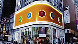
Anamorphic Billboard
Design Challenges
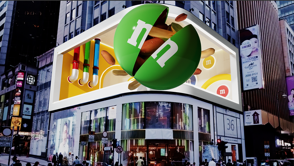
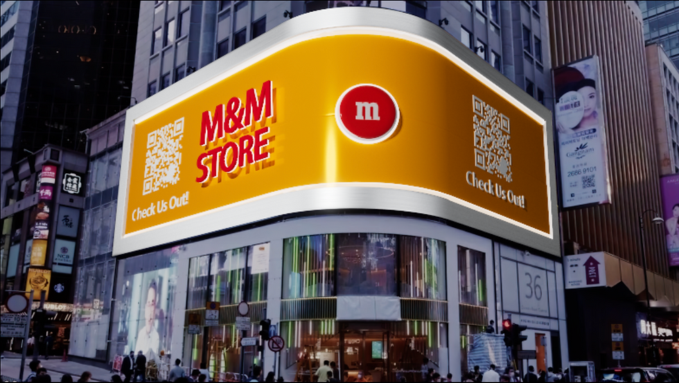
Create a 10 to 15 second looping anamorphic billboard experience for M&M. Use anamorphic illusion and forced perspective techniques to make the product appear as if it’s physically bursting out of the screen and into the viewer’s space. Design a dynamic, immersive activation that goes beyond a static image to captivate and stop people in their tracks.
Software Used:
-
Cinema 4D
-
Houdini
-
After Effects
-
Nuke
Credits:
Chocolate Animation & M&M Model:
Teja Hickenbottom
3D Scene Modeling & Animation:
Sound Design: Kelly Warner
Research


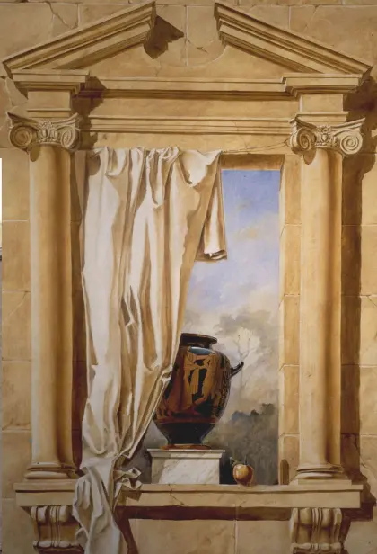
Trompe L’oeil
Trompe L’oeil also known as Trick of the Eye. Originating in ancient Greece and Rome, Trompe L’oeil is an art technique that uses realistic imagery to create the optical illusion that depicted objects exist in three dimensions. It tricks the eye into seeing painted details as real, often making flat surfaces appear to have depth and texture.

M&M's Branding
M&M’s uses a fun, story based branding approach that brings its colorful candies to life through playful characters. Each M&M has a unique personality, like Red being confident and Yellow being silly, which appear in humorous ads and short stories. These lighthearted interactions make the brand feel lively and relatable, turning M&M’s from just candy into a fun, character-filled experience that spreads joy and creativity.
Color Mood Analyzer
When a guest steps up, the machine asks things like “What is your color mood?” and uses your responses (and sometimes your image or silhouette) to determine which color of M&M you are.The result assigns you a specific color of M&M’S, for example, you might “be” a red M&M, a blue one, etc.
It’s interactive and fun, intended as an in-store experience rather than a simple vending machine.


Chocolate Appearance
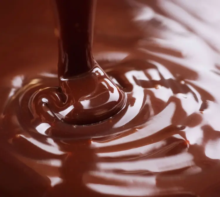
Thickness


Shine

The glossiness and contrasted highlights and a slightly darker tint to the brown make the chocolate feel thinner
There is less contrast to the highlights and a more matte appearance, which the chocolate appear thicker
The melted chocolate has harsh highlights, making the material feel glossy and wet, The shine impacts the feeling of richness and how savory it tastes
The solid chocolate is dull and has no clear highlights at all.
Movement
Chocolate is thicker than water, but when it melts it still flows, just more slowly and heavily. How it moves depends on its temperature: when solid, it keeps its shape and can snap; when partly melted, it softens, the edges droop, and it starts to drip; and when fully melted, it flows smoothly into waves, pools, or drips. Melted chocolate also has surface tension, so it forms smooth edges, rounded drops, and small peaks as it settles. As it spreads, it can break into thin streams, and its stickiness makes it cling to surfaces instead of running off right away.


Color


Take Away
Overall, after examining various chocolate textures and appearances, we incorporated those observations into our simulation. Our goal is to achieve a thinner, drip-like consistency similar to the first reference image so the animation flows efficiently while still looking believable. The coloration will be a smooth, milky brown, and we plan to increase the specular weight to give the chocolate a glossy finish.
People recognize chocolate and caramel as different through their color and feel, chocolate is darker and richer, suggesting depth and indulgence.
Caramel is lighter and golden, giving a sense of warmth and sweetness.

BTS
As another form of reference, I cut an M&M in half and melted the inside by putting it on a heated pan. Once heated up, she put them together and slowly separated them to see the viscosity of the chocolate.
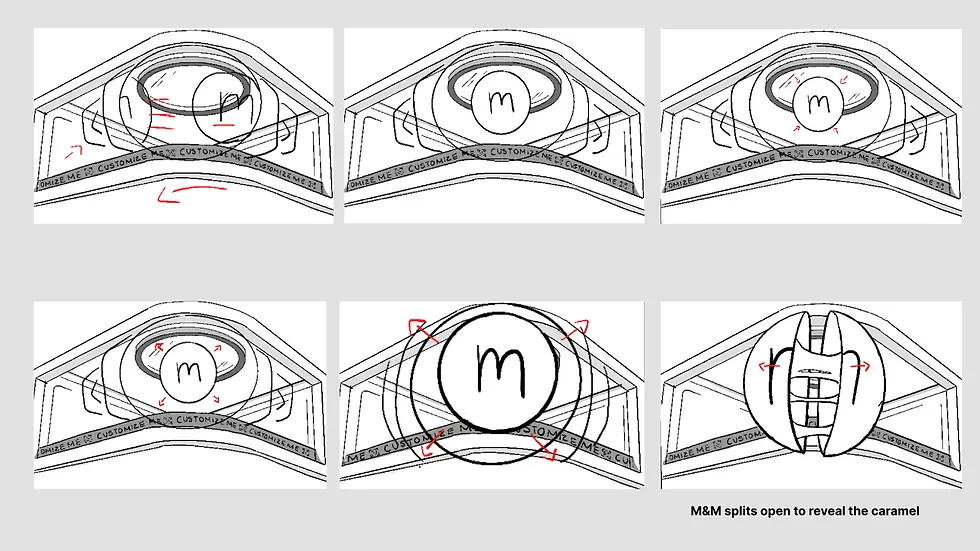
Storyboards


Style Frame Exploration


Simulation Exploration

The simulation is behaving more like flowing water than melted chocolate.

In this version, I introduced an additional object to observe how the sim interacts with it. The collision behaves correctly, and the liquid tapers toward the middle, but it still doesn’t create the distinctive V-shaped flow you typically see in melting chocolate.

The liquid is moving far too slowly and is so thick that it begins to pile up.

In this version, I incorporated the half M&M shells to observe how the chocolate behaves around them. The simulation is accumulating too much at the bottom of the right M&M, and the volume of chocolate pouring out looks unrealistic for what would be inside a real M&M.
Simulation Exploration 02

In this version, I chose to create the chocolate directly in Cinema 4D. I started with a flat oval plane, selected all the points, and extruded the shape. After that, I selected specific sections of the object and extruded them further to form raised beams.

I then imported the chocolate into the scene and scaled it to match the size of the M&M. Once properly scaled, I used sculpting tools to shape the chocolate so it fit perfectly within the two halves of the M&M.

Finally, I keyframed the poses to create smooth transitions between each state. Some challenges arose with the chocolate’s geometry breaking during transitions, but these were resolved by adjusting and refining the Pose Morph.

Next, I duplicated the object, flipped it, and aligned the two pieces. Once positioned correctly, I merged them into a single object and used the Optimize function to remove points that were too close together, cleaning up the geometry. I applied a smooth deformer to create that smooth chocolate look.

I added a Pose Morph tag to the chocolate and created multiple poses: one for when the chocolate is closed, one for fully open, one for fully open with melting chocolate, and one for when the chocolate is being stretched.
Simulation Take Away
Although the chocolate simulation in Houdini was functioning, it didn’t provide the level of control I needed for the animation. By pivoting to Cinema 4D and using a Pose Morph tag, I was able to manually create and fine-tune the chocolate’s movements. This approach gave me significantly more control over the timing, shape, and behavior of the chocolate, resulting in a more precise and polished animation.
Animation Technical Execution

To create a smoother animation, Hailey split the movement across different M&M’s. The first M&M was animated using vertical (Y-axis) movement, entering and exiting the scene to create a natural flow. The second M&M is animated to spin through the scene along a smooth spline path, creating a more seamless motion. Both animations are controlled using display tags, allowing each M&M to be turned on or off as needed.
Animation Pass

To create a smoother animation, Hailey split the movement across different M&M’s. The first M&M was animated using vertical (Y-axis) movement, entering and exiting the scene to create a natural flow. The second M&M is animated to spin through the scene along a smooth spline path, creating a more seamless motion. Both animations are controlled using display tags, allowing each M&M to be turned on or off as needed.
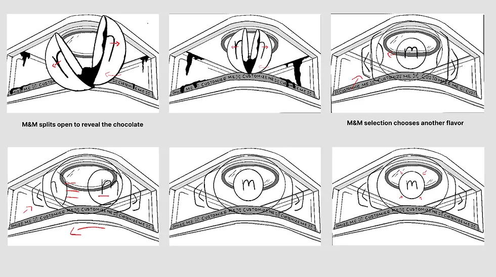
For our second pass, we refined the animation and added the M&M breaking effect. This required using three separate M&M models that are seamlessly animated together, turning them on and off with display settings as needed. There are still issues to address at this stage, including refining the chocolate animation and adjusting the angle. We also need to improve the transitions between each M&M so they are less noticeable, and create a more dramatic break by adding a glow along the seam where the M&M splits.


For our third pass, we adjusted the transitions between the M&Ms and added more anticipation to the initial take off. We also added more tilt to the breaking of the M&M, but remove the chocolate so we could focus on proper movement of the animation.
Flattening Scene

An additional element we wanted to incorporate was flattening the scene for final delivery. I took the 3D mock-up from Cinema 4D and exported it as an alpha render without the surrounding city border. I then imported this render into After Effects and exported it as an MP4. Once that was complete, I brought the MP4 back into Cinema 4D as a texture. From there, I created a plane and bent it to match the shape of the frame, allowing me to apply the MP4 texture directly onto it. After scaling the video to fit the plane’s edges, I generated a UV map so the warped image could correctly project onto the flattened plane.